Build for the web.
00. Introduction to HTML
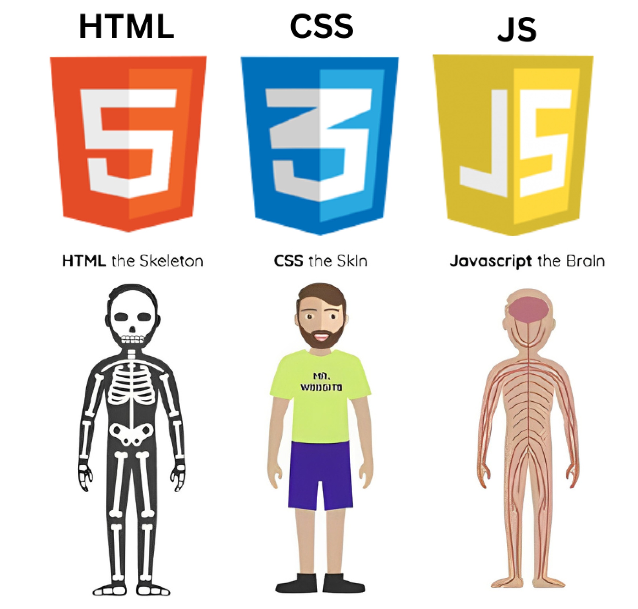
HTML (HyperText Markup Language) is the standard language used to create web pages. It defines the structure and layout of content on a webpage.
- HTML files are saved with the
.htmlfile extension.
A programming language can perform mathematical operations and decision-making, while a markup language is only used to structure and display predefined content.
02. The Skeleton (HTML Structure)
Every HTML document has a basic structure. Think of it as the blueprint for your webpage.
<!DOCTYPE html>
<html>
  <head>
    <title>Page Title</title>
  </head>

  <body>
    <p>My first paragraph.</p>
  </body>

</html>
Explanation of Key Tags
| Tag | Description |
|---|---|
<!DOCTYPE html> |
Declares the document type and HTML version |
<html> |
Root element that contains the entire HTML document |
<head> |
Contains metadata like title, styles, and links |
<title> |
Sets the title shown in the browser tab |
<body> |
Contains the visible content of the webpage |
03. HTML Elements
HTML elements are the building blocks of a webpage. They define the structure and content of a page. An element usually consists of:
- Opening tag – marks the start
- Content – the actual text or material
- Closing tag – marks the end
<p>This is a paragraph</p>
Types of HTML Elements
1. Block-Level ElementsBlock-level elements take up the full width of the page and always start on a new line.
Common block elements: <p>,
<h1>–<h6>, <ul>,
<ol>,
<div>
Inline elements do not start on a new line and only take up as much width as needed. They're usually used inside block elements.
Common inline elements: <a>, <span>,
<b>, <u>, <img>
04. HTML Attributes
Attributes provide extra information about an HTML element. They are written inside the
opening tag
in name="value" format.
<a href="https://www.google.com">Google</a>
Common HTML Attributes
class– Used to apply CSS styles to elementsid– Used to uniquely identify an elementstyle– Used to add inline CSS styles
<p id="intro" class="text" style="color:blue;">Welcome!</p>
05. Text Fundamental Tags
Text fundamentals in HTML refer to the basic elements used to display and structure text on a webpage.
Common Text Fundamental Tags
| Tag | Description | Example |
|---|---|---|
<h1> to <h6> |
Defines headings (largest to smallest) | <h1>Main Title</h1> |
<p> |
Defines a paragraph | <p>This is a paragraph.</p> |
<br> |
Inserts a line break |
Line 1 Line 2 |
<hr> |
Creates a horizontal line |
Line above
Line below |
List in HTML
1. Ordered List
An Ordered List displays items in a numbered sequence.
<ol> type="A" start="1"
  <li>HTML</li>
  <li>CSS</li>
  <li>JavaScript</li>
</ol>
- HTML
- CSS
- JavaScript
2. Unordered List
An Unordered List displays items in a bulleted sequence.
<ul> type="disc"
  <li>Home</li>
  <li>About</li>
  <li>Contact</li>
</ul>
- Home
- About
- Contact
Types:
disc(default) - solid circlecircle- circlesquare- solid square
3. Description List
An Description List displays items in a description format.
<dl>

  <dt>HTML</dt>
  <dd>HyperText Markup Language</dd>

  <dt>CSS</dt>
  <dd>Used for styling web pages</dd>

</dl>
- HTML
- HyperText Markup Language
- CSS
- Used to style web pages
06. Text Formatting Tags
HTML provides several tags to format text with special emphasis and styling.
Bold Text <b> and <strong>
Both make text bold, but <strong> indicates semantic importance.
<p>This is <b>bold</b> text.</p>
<p>This is <strong>important</strong> text.</p>
Italic Text <i> and <em>
Both make text slanted, but <em> indicates semantic emphasis.
<p>This is <i>italic</i> text.</p>
<p>This is <em>emphasized</em> text.</p>
Underline <u>
Underlines the text.
<p>This is <u>underlined</u> text.</p>
Superscript <sup>
Positions text slightly above the baseline. Great for exponents and citations.
<p>2<sup>3</sup> = 8</p>
Subscript <sub>
Positions text slightly below the baseline. Useful for chemical formulas.
<p>H<sub>2</sub>O is water</p>
07. Hyperlinks
Hyperlinks allow you to navigate between pages and resources.
Creating Links <a>
The <a> anchor tag creates a hyperlink.
<a href="https://www.example.com">Visit Example</a>
Using the target attribute to open links in a new tab:
<a href="https://www.example.com" target="_blank">Visit Example in New Tab</a>
Other target options:
_self(default): Opens the link in the same frame._blank: Opens the link in a new window or tab.
Link to a section on the same page (Document Fragments)
You can link to a specific section within the same page using an anchor tag.
<a href="#contact_id">Go to Section</a>
<!-- Somewhere on the same page -->
<h2 id="contact_id">Contact Us</h2>
08. Tables
Tables are used to display data in a structured format ie in rows and columns.
Creating Tables <table>
The <table> tag creates a table.
<table>
<thead>
    <tr>
        <th>Name</th>
        <th>Age</th>
    </tr>
</thead>
<tbody>
    <tr>
        <td>John</td>
        <td>25</td>
    </tr>
    <tr>
        <td>Nima</td>
        <td>35</td>
    </tr>
</tbody>
</table>
| Name | Age |
|---|---|
| John | 25 |
| Nima | 35 |
Important Table Tags
| Tag | Use |
|---|---|
<table> |
Creates a table |
<tr> |
Defines a row in the table |
<th> |
Defines a header cell in the table |
<td> |
Defines a standard cell in the table |
<caption> |
Provides a title or description for the table |
<thead> |
Groups the header section |
<tbody> |
Groups the main body data |
<colspan> |
Merges columns |
<rowspan> |
Merges rows |
Practice Task
1.Student Result Table
| Subject | Marks | Grade |
|---|---|---|
| Math | 85 | A |
| Science | 78 | B |
| English | 90 | A+ |
| Total Marks | 343 | |
| Overall Grade | A | |
2.User Info Table
| User Info | |||
|---|---|---|---|
| Name | Age | Father name | Mother name |
| Sujan | 30 | Jit Tamang | Uma Tamang |
| Nima | 25 | Bom Bahadur Tamang | Laxmi Tamang |
| Pemba | 25 | ||
09. Image Tag
The <img> tag is used to embed an image in an HTML page.
<img src="image.jpg" alt="Description of image">
10. Iframe Tag
The <iframe> tag is used to embed another HTML page within the current
page.
Common iframe Attributes
| Attribute | Meaning |
|---|---|
<src> |
Page/video link |
<width> |
Frame width |
<height> |
Frame height |
<allowfullscreen> |
Allows full screen video |
11. Form Tag
The HTML form is used to collect user input and send it to a server for processing.
<form id="userForm" name="userForm">

    <label for="name">Name:</label>
    <input
        type="text"
        id="name"
        name="name"
        placeholder="Enter your name">

    <br><br>

    <label for="email">Email:</label>
    <input
        type="email"
        id="email"
        name="email"
        placeholder="Enter your email">

    <br><br>

    <label>Gender:</label>

    <input
        type="radio"
        id="male"
        name="gender"
        value="male"> Male

    <input
        type="radio"
        id="female"
        name="gender"
        value="female"> Female

    <input
        type="radio"
        id="other"
        name="gender"
        value="other"> Other

    <br><br>

    <button type="submit">Submit</button>

</form>
Common Input Tags
| Type | Use | Example | Output |
|---|---|---|---|
| text | Single-line text input | <input type="text"> |
|
| password | Hidden text input | <input type="password"> |
|
| Email input validation | <input type="email"> |
||
| number | Numeric input | <input type="number"> |
|
| radio | Select one option | <input type="radio"> |
Option 1 Option 2 |
| checkbox | Select multiple options | <input type="checkbox"> |
A B |
| file | Upload file | <input type="file"> |
|
| date | Select date | <input type="date"> |
|
| submit | Submit form | <input type="submit" value="Submit"> |
|
| hidden | Stores data that is not visible to the user | <input type="hidden" value="123"> |
(Not visible on page) |
Textarea
Used for long text input
<label for="message">Message:</label>

<textarea
    id="message"
    name="message"
    placeholder="Write your message here..."
    rows=4
    cols=30>
</textarea>
Select (Dropdown)
Used to create dropdown list.
<label for="country">Country:</label>

<select
    id="country"
    name="country">

    <option>Nepal</option>
    <option>India</option>
    <option>USA</option>

</select>
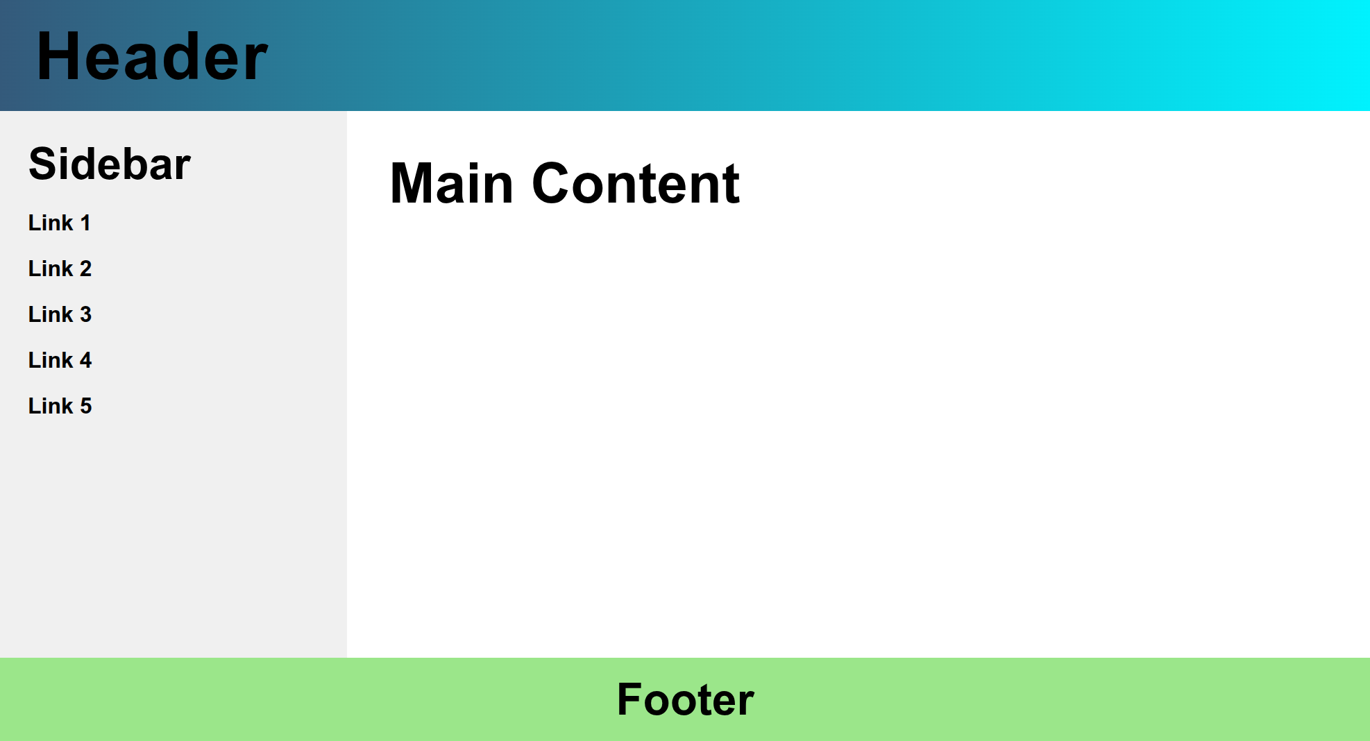
12. Webpage Layout
A webpage layout is the arrangement of different sections on a webpage, such as:
- Header - The top section of the webpage that typically contains the logo, title, and main navigation.
- Navigation - The menu or links that allow users to navigate through the website.
- Main Content - The primary content area of the webpage.
- Sidebar - A column usually located on the side of the main content, often used for additional links, ads, or information.
- Footer - The bottom section of the webpage that typically contains copyright information, contact details, and additional links.
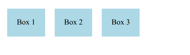
13. Flexbox
Flexbox is a CSS layout system used to arrange and align elements easily inside a container. It allows items to be organized in rows or columns with flexible spacing and alignment.

To use Flexbox, first make a container a flex container, then control how its child elements behave.
1️⃣ Create a Flex Container
Set display: flex on the parent element.
<div class="container">
<p class="box">Box 1</p>
<p class="box">Box 2</p>
<p class="box">Box 3</p>
</div>
.container {
    display: flex;
}
.box {
    background-color: lightblue;
    padding: 20px;
    margin: 10px;
    text-align: center;
}
Important Flexbox Properties
Container Properties (applied to parent)
| Property | Description | Example |
|---|---|---|
display: flex; |
Makes container a flex container | .container { display: flex; } |
gap |
Space between items (vertical/horizontal) | gap: 10px; |
flex-direction |
Direction of items (row/column) | flex-direction: row; or column; |
justify-content |
Horizontal alignment of items |
justify-content: center;space-between;
space-around;
|
align-items |
Vertical alignment of items |
align-items: center;
flex-start;
flex-end;
|
Item Properties (applied to child)
| Property | Description | Example |
|---|---|---|
flex |
Grow/shrink space | flex: 1; |
align-self |
Overrides container alignment | align-self: flex-end; |
order |
Change visual order | order: 2; |
Examples with Flexbox
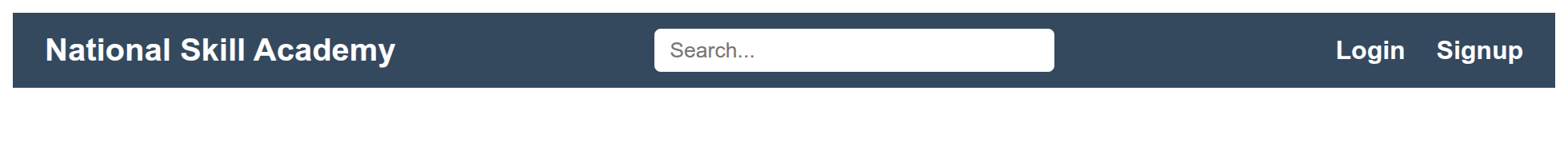
1. Navigation (Header)
<style>
.header {
  display: flex;
  align-items: center;
  justify-content: space-between;
  padding: 10px 20px;
  background-color: #34495e;
  color: white;
}

.logo {
  font-weight: bold;
  font-size: 20px;
}

.search-box input {
  padding: 6px 10px;
  border-radius: 4px;
  border: none;
  width: 250px;
}

.auth-links a {
  color: white;
  text-decoration: none;
  margin-left: 15px;
  font-weight: bold;
}

.auth-links a:hover {
  text-decoration: underline;
}
</style>

<div class="header">
  <div class="logo">National Skill Academy</div>

  <div class="search-box">
    <input type="text" placeholder="Search..." />
  </div>

  <div class="auth-links">
    <a href="#">Login</a>
    <a href="#">Signup</a>
  </div>
</div>
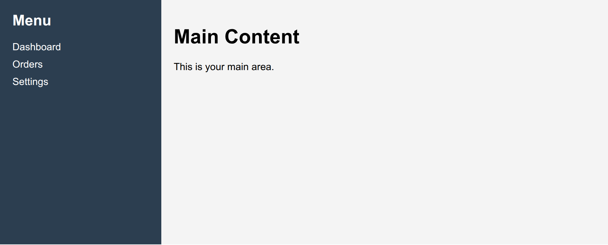
2. Sidebar with Main Content
<style>
.container {
  display: flex;
  min-height: 100vh;
}

.sidebar {
  width: 220px;
  background: #2c3e50;
  color: white;
  padding: 20px;
}

.sidebar a {
  display: block;
  color: white;
  text-decoration: none;
  margin: 10px 0;
}

.content {
  flex: 1;
  padding: 20px;
  background: #f4f4f4;
}
</style>

<div class="container">
  <div class="sidebar">
    <h2>Menu</h2>
    <a href="#">Dashboard</a>
    <a href="#">Orders</a>
    <a href="#">Settings</a>
  </div>

  <div class="content">
    <h1>Main Content</h1>
    <p>This is your main area.</p>
  </div>
</div>
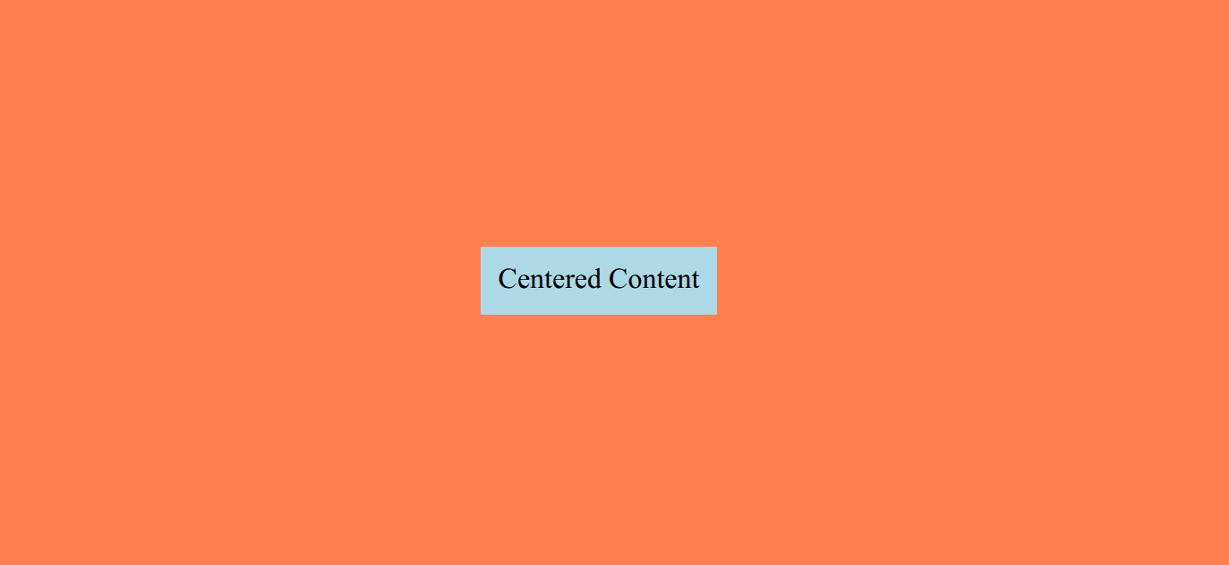
3. Centering an Element
<style>
.container {
  display: flex;
  justify-content: center;
  align-items: center;
  height: 100vh;
  background-color: coral;
}

.centered-content {
  background-color: lightblue;
  padding: 10px;
}
</style>

<div class="container">
  <div class="centered-content">
    Centered Content
  </div>
</div>
14. Grid
Grid is a CSS layout system used to create complex, two-dimensional layouts. It allows for precise control over rows and columns.
To use Grid, first make a container a grid container, then control how its child elements behave.
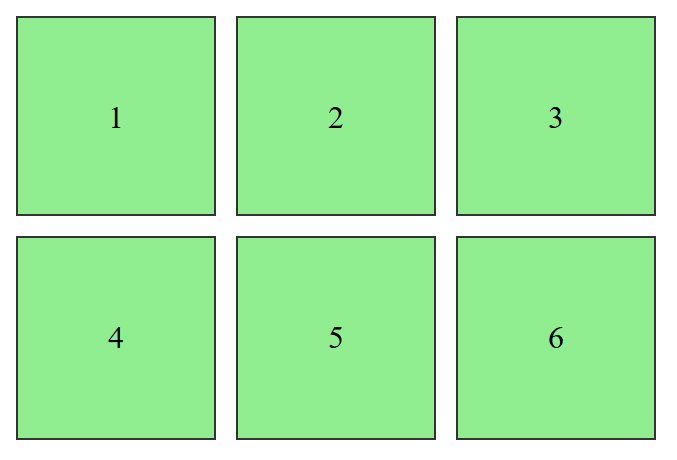
<style>
.grid-container {
  display: grid;
  grid-template-columns: 1fr 1fr 1fr;
  grid-template-rows: 100px;
  gap: 10px;
}

.item {
  background-color: lightgreen;
  text-align: center;
  line-height: 100px;
  border: 1px solid #333;
}
</style>


<div class="grid-container">
  <div class="item">1</div>
  <div class="item">2</div>
  <div class="item">3</div>
  <div class="item">4</div>
  <div class="item">5</div>
  <div class="item">6</div>
</div>
Important Grid Properties
Container Properties (applied to parent)
| Property | Description |
|---|---|
display: grid; |
Makes container a grid container |
grid-template-columns |
Defines column sizes |
grid-template-rows |
Defines row sizes |
gap |
Spaces between rows & columns |
Item Properties (applied to child)
| Property | Description |
|---|---|
grid-column |
Span or position of columns |
grid-row |
Span or position of rows |
justify-self |
Horizontal alignment inside cell |
align-self |
Vertical alignment inside cell |
Example: Bento Grid
<style>
.grid-container {
  display: grid;
  grid-template-columns: 1fr 1fr 1fr;
  grid-template-rows: 100px 100px 100px;
  grid-gap: 10px;
  grid-template-areas:
                "header header header"
                "sidebar main main"
                "sidebar main main"
                "footer footer footer";
}

.header {
  grid-area: header;
  background-color: lightblue;
  text-align: center;
  line-height: 100px;
}

.sidebar {
  grid-area: sidebar;
  background-color: lightgreen;
  text-align: center;
  line-height: 100px;
}

.main {
  grid-area: main;
  background-color: lightcoral;
  text-align: center;
  line-height: 100px;
}

.footer {
  grid-area: footer;
  background-color: tomato;
  line-height: 100px;
  text-align: center;
}

</style>

<div class="grid-container">
  <div class="header">Header</div>
  <div class="sidebar">Sidebar</div>
  <div class="main">Main Content</div>
  <div class="footer">This is footer</div>
</div>
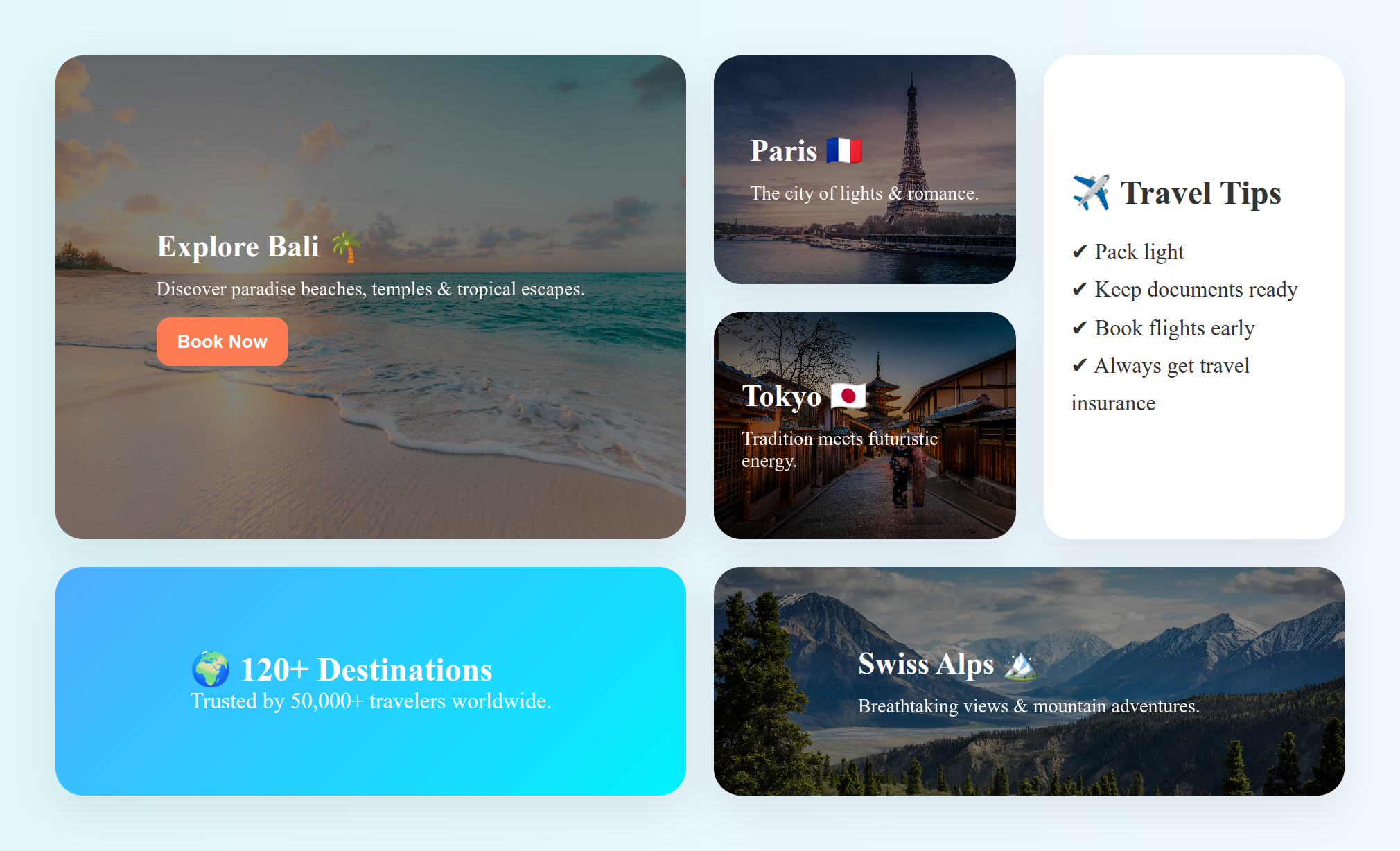
Practice Task
Create a bento design as shown in the picture below:
15. Media Query
A media query is a CSS technique that allows you to apply styles based on the device’s screen size or type.
Use Case:
- Make text bigger on small screens
- Change layout on mobile
- Hide certain elements on smaller devices
Basic Syntax
<style>
@media (condition) {
  /* CSS styles applied when condition is true */
}
</style>
Common Media Query Conditions
| Condition | Description | Example |
|---|---|---|
| max-width | Applies styles when screen width is less than or equal to a value |
@media (max-width: 768px) { body { background: lightblue; } }
|
| min-width | Applies styles when screen width is greater than or equal to a value |
@media (min-width: 1024px) { body { background: lightgreen; } }
|
| orientation | Checks if the screen is portrait or landscape |
@media (orientation: portrait) { body { background: lightpink; } }
|
Common Device Breakpoints
| Condition | Description | Example |
|---|---|---|
| max-width | Applies styles when screen width is less than or equal to a value |
@media (max-width: 768px) { body { background: lightblue; } }
|
| min-width | Applies styles when screen width is greater than or equal to a value |
@media (min-width: 1024px) { body { background: lightgreen; } }
|
| orientation | Checks if the screen is portrait or landscape |
@media (orientation: portrait) { body { background: lightpink; } }
|